What is a Radar Plot (Spider Chart)?
A radar plot (also called spider chart or star chart) is a multivariate visualization used to compare several quantitative variables across one or more entities.
Each variable is represented as an axis radiating from a central point. Values are plotted along these axes and connected to form a polygon.
At a glance, radar plots answer the question:
“Where are the strengths, weaknesses, and trade-offs across multiple dimensions?”
How to Read a Radar Plot
Key interpretation rules:
Each axis is one dimension
Examples:
- Cost
- Service level
- Forecast accuracy
- Flexibility
- Reliability
Distance from the center = magnitude
Further out means “more” of that metric.
The shape matters more than the absolute values
- Balanced shape → well-rounded solution
- Sharp spikes → specialization
- Indentations → weaknesses
Comparisons work best with 2–3 entities
Overlaying many polygons quickly becomes unreadable.
Typical Use Cases
Radar plots are especially useful when:
1. Comparing Alternatives
- Inventory policies (EOQ vs. dynamic planning)
- Forecasting models
- Suppliers or logistics partners
- ERP configuration options
2. Communicating Trade-offs
Radar plots shine where no single metric dominates, e.g.:
- Lower cost vs. higher service level
- Speed vs. stability
- Flexibility vs. efficiency
3. Executive & Stakeholder Reporting
They are:
- Intuitive
- Compact
- Easy to discuss in workshops
Where Radar Plots Work Well (and Where They Don’t)
Strengths
- Multidimensional comparison
- Pattern recognition
- Storytelling with data
⚠️ Limitations
- Poor for large numbers of variables (>8–10)
- Sensitive to axis scaling
- Not ideal for precise numeric comparison
Rule of thumb:
Radar plots are for insight, not for exact measurement.
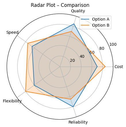
Example: Inventory Strategy Comparison
Imagine two inventory strategies evaluated along five dimensions:
- Cost efficiency
- Service quality
- Replenishment speed
- Operational flexibility
- Reliability
The comparison radar plot (like the third chart above) immediately shows:
- Strategy A is stronger in reliability and quality
- Strategy B excels in cost and flexibility
- Neither dominates across all dimensions
This makes radar plots very effective in inventory optimization discussions, especially when arguing for a more balanced, dynamic policy.
Creating Radar Plots in R
Option 1: Using fmsb (classic and simple)
library(ggradar)
library(dplyr)
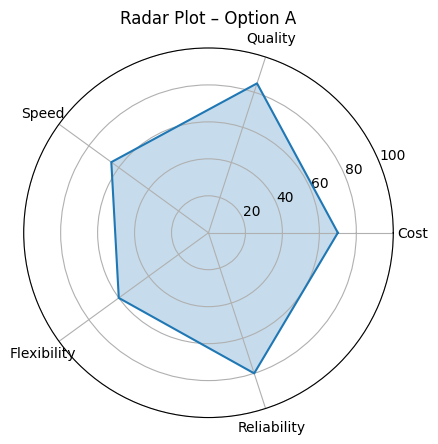
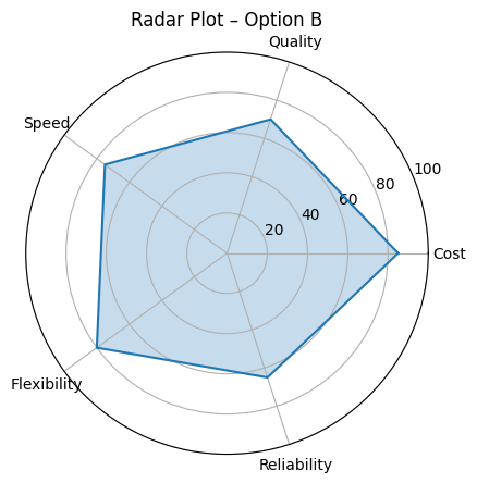
data <- data.frame(
group = c("Option A", "Option B"),
Cost = c(70, 85),
Quality = c(85, 70),
Speed = c(65, 75),
Flexibility = c(60, 80),
Reliability = c(80, 65)
)
ggradar(
data,
grid.min = 0,
grid.mid = 50,
grid.max = 100,
values.radar = c("0%", "50%", "100%"),
legend.position = "right"
)Option 2: Using ggradar (ggplot-style)
library(ggradar)
library(dplyr)

data <- data.frame(
  group = c("Option A", "Option B"),
  Cost = c(70, 85),
  Quality = c(85, 70),
  Speed = c(65, 75),
  Flexibility = c(60, 80),
  Reliability = c(80, 65)
)

ggradar(
  data,
  grid.min = 0,
  grid.mid = 50,
  grid.max = 100,
  values.radar = c("0%", "50%", "100%"),
  legend.position = "right"
)
Conclusion:
Use radar plots when you want to compare multiple attributes across alternatives in a visually intuitive way — such as comparing model performance or risk profiles.