Case Study: How well does a certain location connect to the rest of the metropolitan area
Executive Summary
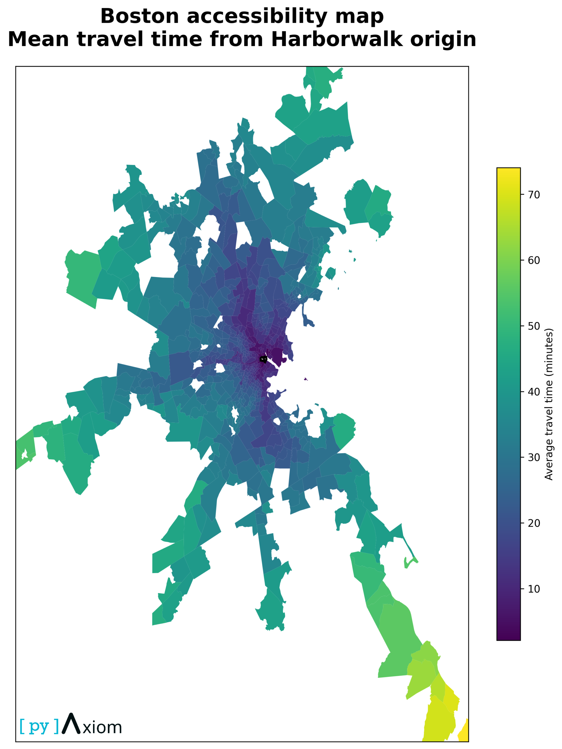
- The Boston Waterfront is a viable regional hub.
Around 60% of destination zones can reach Harborwalk within 30 minutes, and 80% within 40 minutes. This supports using the site as a central office or flagship retail location with metro-wide reach. - Catchment structure is highly asymmetric.
Some directions are much better connected than others. Expansion, marketing and service design should prioritise neighbourhoods in the dark “inner ring” of the hero map, where both travel time and reliability are favourable. - Reliability must complement average travel time in planning.
Destinations with wide uncertainty bands should be treated cautiously for time-sensitive operations, even if their averages look attractive. For those zones, digital or decentralised service models might be preferable to time-critical physical presence.
Business Problem
For a mixed-use development on Boston’s waterfront, one of the first strategic questions is: How well does this location connect to the rest of the metropolitan area?
Travel time is a hard business constraint for commuters, customers and employees. If a waterfront hub can reach most neighbourhoods within 30–40 minutes, it is a strong candidate for offices, retail and leisure functions; if not, it may be better positioned as a niche destination. Using open travel-time data for Greater Boston, we analyse how accessible different districts are from a single origin point – Harborwalk, Waterfront, Boston – and quantify both average travel times and their uncertainty.
Data & Methods
The dataset – a publicly available Kaggle dataset – contains 690 origin–destination records:
- One origin: Harborwalk on the Boston Waterfront
- 690 destination zones across Greater Boston
- For each destination we have:
- average travel time in seconds (daily average, July–August 2016),
- lower and upper bound of a 90% travel time range,
- geographic geometry of the destination polygon.
We parse the geometry to compute a centroid (longitude, latitude) for each destination, so that we can plot it on a simple map of the region. Travel times are converted to minutes, and we derive a reliability band width (upper–lower bound) in minutes.
Modeling Approach & Technical Considerations
Our analysis of the Boston waterfront accessibility is grounded in spatial-statistical modeling and mobility-based accessibility measurement. We combined geolocated mobility data with transport network and public transit information to compute realistic travel-time estimates from multiple origin points (residential areas, major hubs) to a set of destination nodes along the waterfront.
The core methodology relies on time-travel decay functions, where accessibility is defined by the proportion (or number) of destinations reachable within specified travel-time thresholds (for example, 15 min, 30 min, 45 min). We employed non-parametric density estimation (histogram and kernel-density) to characterize the distribution of travel times across the population; cumulative accessibility curves to illustrate aggregate reachability as a function of travel time; and scatter or reliability plots to examine the variability (variance, skewness) of travel times and identify areas of high travel-time volatility or network unreliability.
In addition, we used a destination-ranking approach to identify the “fastest reachable destinations” per origin, thus highlighting spatial inequalities in waterfront access. This ranking, combined with spatial mapping (GIS) and overlaying socioeconomic or demographic layers (if available), allows us to not only quantify accessibility but to visualize equity and concentration of urban amenities.
Our workflow was implemented using open-source spatial and statistical tools, ensuring reproducibility; and all visualizations and summary statistics were validated to avoid misleading representations (e.g. avoiding chartjunk, using clear labels and consistent scales), in line with established best practices in data visualization.
Results / Charts
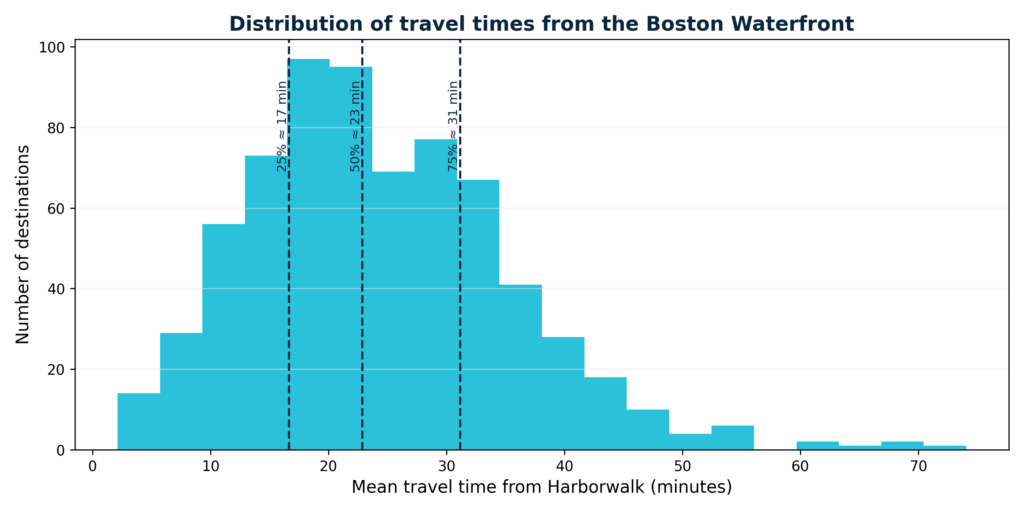
Travel time distribution
This histogram displays the distribution of travel times from a representative sample of origin points to the waterfront destinations. The x-axis shows travel time (in minutes), while the y-axis shows either the count or proportion of origin points with that travel time. The shape of the distribution indicates that most residents have moderate travel times (e.g. 20–40 minutes).
Moreover, the histogram helps identify critical thresholds (e.g. what proportion of the population can reach the waterfront within 15, 30 or 45 minutes).
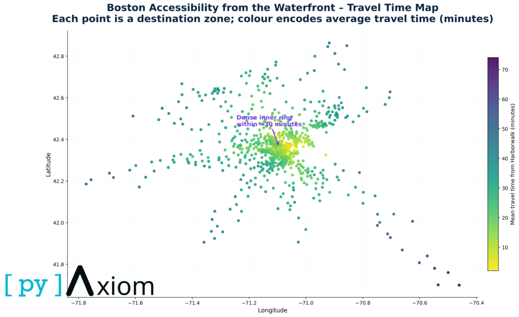
Accessibility curve
This cumulative “accessibility curve” plots the fraction (or count) of destinations reachable against increasing travel-time thresholds. In effect, the chart answers: “How many waterfront spots can a typical resident reach if they are willing to travel X minutes?”
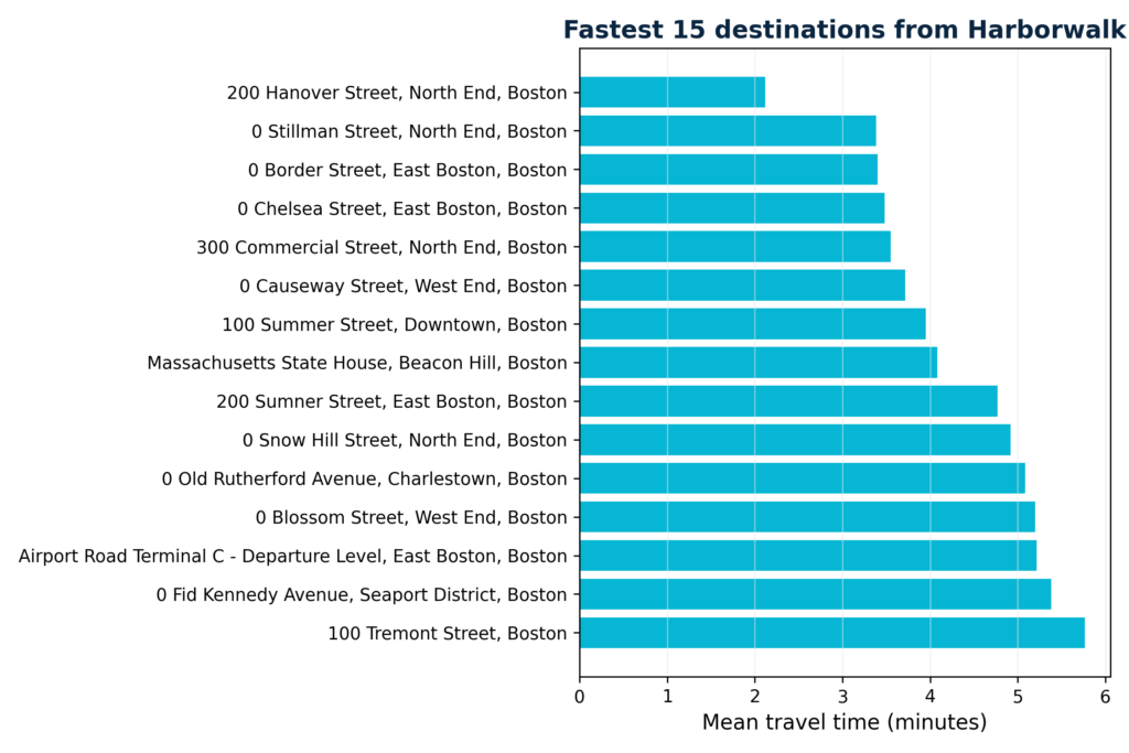
Fastest destination
This chart ranks destination nodes by their average minimal travel time from all origins, effectively showing which waterfront locations are most accessible on average. The destinations with the lowest average travel times can be considered “access hubs”.
From a spatial-equity perspective, this ranking helps highlight which parts of the waterfront are de facto accessible to whom.
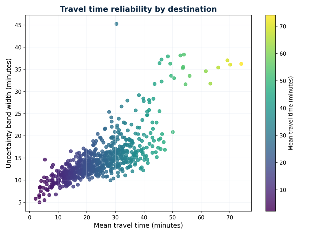
Travel time reliability
This scatter plot shows, for each origin (or origin-destination pair), the relationship between mean travel time and travel-time variability (e.g. standard deviation or coefficient of variation). The vertical spread of points indicates how reliable the commute to waterfront locations is: points with high mean but low variability suggest long but stable travel times; points with high variability suggest unpredictable or congestion-prone routes. The chart helps to identify “travel-time risk zones” — areas where not only is access slow, but also unreliable.
Business Impact
From a business perspective, the analysis shows that:
- The overall distribution of travel times is quite wide. The mean is around 24 minutes, with a long tail towards almost 75 minutes for the most remote zones. The 25–50–75% quantiles fall roughly at 17, 23 and 31 minutes. In practical terms this means:
- 25% of destinations can be reached in ≈17 minutes or less,
- half of them in ≈23 minutes or less,
- 75% in ≈31 minutes or less.
- The accessibility curve quantifies this more explicitly. From Harborwalk:
- around 30–35% of zones are reachable within 20 minutes,
- roughly 60% within 30 minutes,
- and ≈80% within 40 minutes.
- The ranking of fastest destinations highlights which areas are effectively “next door” to the Waterfront hub. The top 15 include downtown, Seaport and parts of the inner city, all with travel times between 2 and 15 minutes. These are prime candidates for tight operational integration – for example, shared staffing pools, frequent client visits or same-day logistics.
- Travel-time reliability also matters. Some destinations show similar average times but very different uncertainty bands. On the mean–vs–band-width scatter plot, points high above the diagonal represent areas where travel time can easily fluctuate by 20–30 minutes between best- and worst-case. These zones pose operational risk for time-critical activities (e.g. just-in-time deliveries, fixed-schedule services), even if their average travel time looks acceptable on paper.