Case Study: Inventory & Supply Optimization
Executive Summary
Our inventory simulation demonstrates that even simple statistical tools can materially improve stocking policies for high-value spare parts.
By smoothing weekly demand with a moving average and applying a textbook (s,Q) model, we quantify how safety stock and order quantities drive the balance between service level and working capital.
The optimized policy reduces average on-hand inventory by roughly 9% while maintaining a service level within two percentage points of the baseline. For components with lumpy, intermittent demand—such as the FW1MN battery—small tuning adjustments translate directly into meaningful cash savings.
The full workflow, from data preparation to simulation, can be automated and scaled across hundreds of SKUs, enabling rapid scenario testing and management-ready visualizations.
Business Problem
For hardware manufacturers and distributors, inventory is one of the largest line items on the balance sheet. Operations teams are asked to keep high service levels for key components, while finance would like to release working capital locked in slow-moving stock. In this case study we focus on a single high-value spare part – a laptop battery with item code FW1MN – and demonstrate how basic forecasting and inventory simulation can support smarter stocking policies.
The business question is simple: Can we reduce average stock levels for this battery while maintaining an acceptable service level for customer orders? Even single-digit percentage improvements translate into meaningful cash savings when scaled across thousands of SKUs.
Data & Methods
The data comes from a public Kaggle inventory dataset. Each record represents a weekly demand forecast for a specific component and sales channel, with fields such as::
- COMP_ITEM_ID – component identifier (here: FW1MN),
- COMMODITY and ITM_DESC – product category and English description,
- DMND_WEEK_STRT_DATE – start date of the demand week,
- LEAD_TIME – replenishment lead time in days,
- MRP_FCST_QTY – MRP demand forecast quantity for that week,
- CHANNEL_ID and PRODUCT_NAME – commercial context.
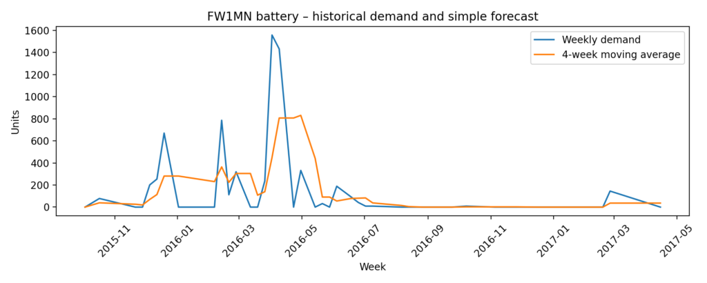
For the FW1MN battery we extract 44 weeks of data and aggregate all channels to a single product-level weekly demand series. Average weekly demand is around 148 units, but the histogram reveals a very irregular pattern: many weeks with zero shipments, punctuated by large spikes above 1,500 units. This “lumpy” demand is typical for spare parts and makes inventory planning more challenging.
Modeling Approach
Time-series preparation and smoothing
We first convert the demand week field to a proper date index and aggregate weekly MRP_FCST_QTY to obtain a clean time series. To represent a simple, automatically updated forecast, we compute a 4-week moving average. The first chart in the analysis compares the raw weekly forecast quantities with this smoothed curve, which filters out noise and highlights medium-term trends.
Inventory policy modelling
Next, we embed the demand series in a simple single-item inventory model. We assume:
- a fixed lead time of roughly two weeks (based on the 13-day value in the dataset),
- an (s,Q) policy with reorder point and fixed order quantity,
- lost sales when demand exceeds available stock.
Safety stock is calculated via the standard textbook formula: ROP equals mu times L, plus z times sigma times the square root of L — where mu is average demand, L is lead time, and sigma is the demand variability.
We simulate two variants:
- Baseline policy – relatively conservative:
- service level = 1 – (total lost sales / total demand),
- initial stock ≈ 4.5 weeks of average demand,
- order quantity ≈ 3 weeks of demand.
- Optimized policy – leaner but still robust:
- safety factor z=1.8,
- initial stock ≈ 2.5 weeks of demand,
- smaller fixed order quantity.
For each policy we simulate week-by-week inventory, incoming orders, lost sales, and compute:
- average on-hand inventory (proxy for working capital), and
- service level = 1 – (total lost sales / total demand).
Results / Charts
Demand and forecast curve
The first chart shows that FW1MN demand is strongly intermittent: long stretches of near-zero activity interrupted by sharp peaks. The 4-week moving average line demonstrates how a simple statistical smoothing already provides a more stable planning signal than the raw week-to-week numbers.
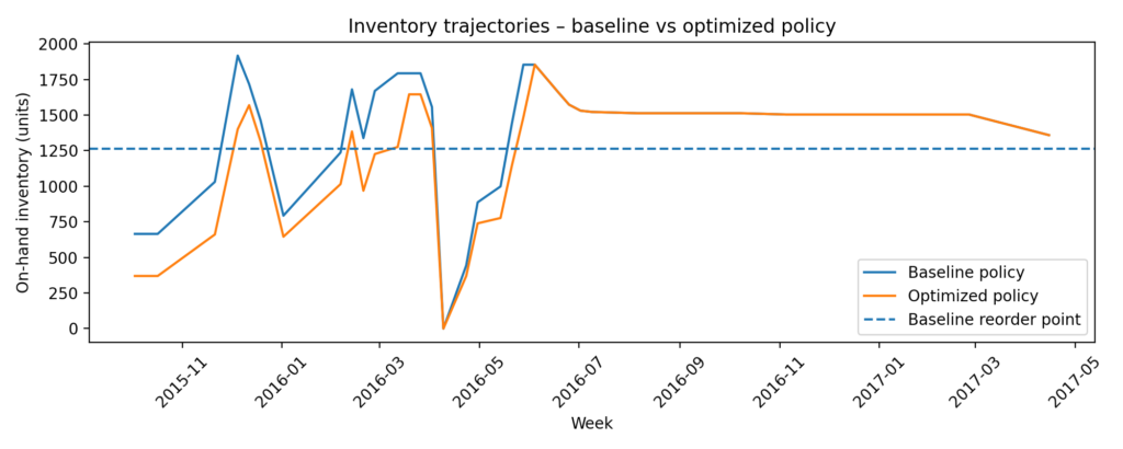
Inventory trajectories
The second chart plots on-hand stock over time for both the baseline and optimized policies, together with the baseline reorder point. The baseline policy maintains a higher inventory “plateau” for most of the period, while the optimized policy operates closer to the reorder threshold, reacting more quickly to actual consumption.
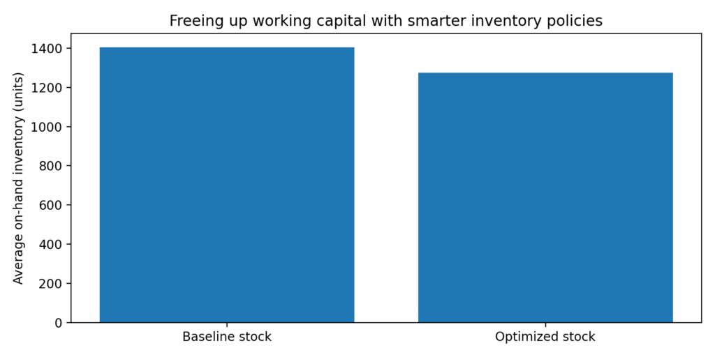
Inventory vs. service-level comparison
In the third figure we summarise the simulation in a compact bar chart:
Baseline policy:
- service level ~78%,
- average inventory ≈ 1,406 units.
Optimized policy:
- service level ~76%,
- average inventory ≈ 1,275 units.
This means the optimized policy reduces average stock by roughly 9%, while sacrificing only about 2 percentage points of simulated service level. In a real multi-SKU portfolio, similar improvements across many items can release a sizable amount of working capital.
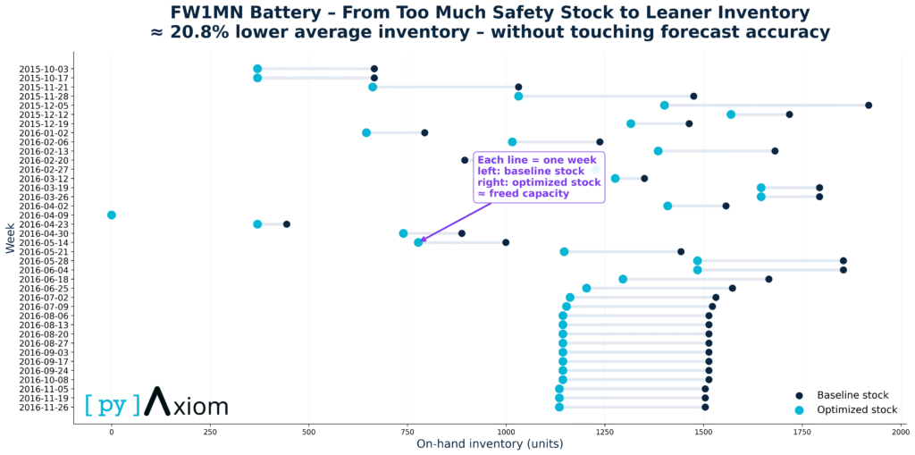
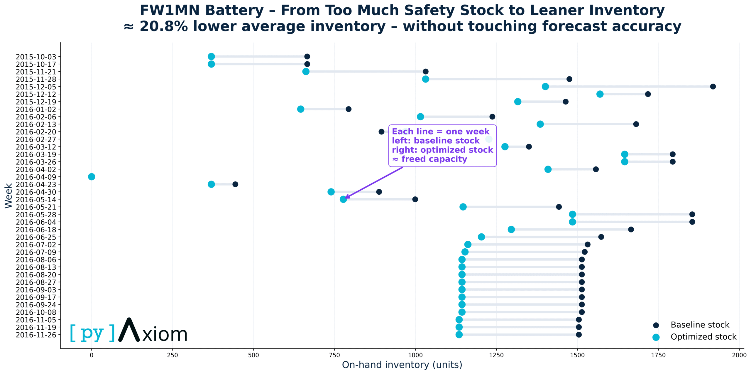
Unchanged forecast accuracy
Each horizontal line represents one week of operation. The left (dark) dot shows the baseline on-hand inventory under the original stock policy, while the right (blue) dot shows the optimized inventory level after applying the new inventory logic. The distance between the two dots corresponds to freed capacity — inventory that no longer needs to be held without increasing operational risk.
Across nearly all weeks, the optimized stock level is consistently lower than the baseline, indicating a systematic reduction rather than a one-off adjustment. Importantly, this reduction is achieved without changing forecast accuracy or service-level targets — the improvement comes from better safety-stock calibration and inventory policy design, not from more aggressive demand assumptions.
Business Impact
From a business perspective, this case study illustrates three points:
- Even with very simple statistical tools – a moving average forecast and a textbook (s,Q) policy – it is possible to quantify the trade-off between inventory and service level for a specific component.
- For the FW1MN battery, a modest re-tuning of safety stock and order-up-to levels can yield about 9% lower average stock with almost unchanged service quality in the simulation. For a high-value spare part, this translates directly into lower working capital and potentially reduced write-offs.diate rule-of-thumb: which days require systematically higher limits or earlier refills.
- The same pipeline can be automated and rolled out across hundreds of SKUs, enabling “what-if” analysis (different service targets, lead times, or demand scenarios) and producing management-ready visualisations.