Case Study: Network analytics on corporate e-mail
Executive Summary
Modern organisations run on e-mail. But who actually influences information flow? Which people sit at the centre of cross-team communication, and where do we see potential bottlenecks or single points of failure?
In this case study we use a large anonymised corporate e-mail network (the EuAll SNAP dataset) to answer a simple but powerful question:
“Who e-mails whom – and what does that reveal about hidden influencers in the organisation?”
Business Problem
In large organisations, a small number of mailboxes typically carry a disproportionate share of communication: senior managers, project coordinators, operational hubs.
The EuAll email network allows us to quantify this pattern and to identify:
- which mailboxes act as communication hubs or bottlenecks,
- how unevenly email traffic is distributed across the organisation,
- and what this implies for governance, risk, and change-management.
Data & Methods
The dataset is stored in Matrix Market (.mtx) format as a large, sparse adjacency matrix:
- 265,214 nodes – anonymised e-mail accounts inside a European institution.
- ~419,000 directed edges – each edge represents at least one e-mail from user i to user j.
- There are no timestamps or message content; we only use the who-e-mailed-whom pattern.
From this we build a directed graph where:
- In-degree = how many distinct people send e-mails to a given node.
- Out-degree = how many distinct people a node sends e-mails to.
- Total degree = in-degree + out-degree, used as a simple overall influence score.
We ignore self-loops and treat multiple e-mails between the same pair as one edge, which keeps the focus on relationship breadth rather than raw volume.
Methods and analytics
The pipeline implements several complementary views:
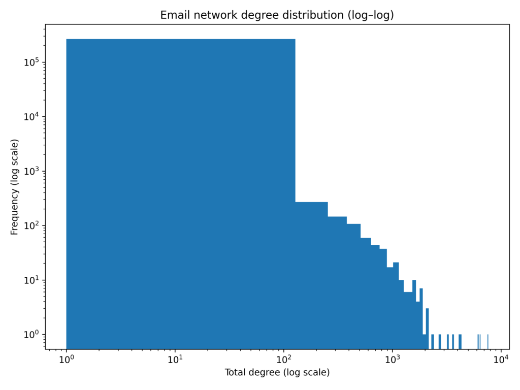
- Global degree distribution (log–log histogram).
This shows how many people have 1, 2, 5, … incoming/outgoing connections and reveals whether the network is “flat” or dominated by a few hubs. - Top in-degree and top out-degree rankings.
- Top in-degree nodes are information magnets – many people write to them (e.g. shared mailboxes, senior leaders, helpdesks).
- Top out-degree nodes are broadcast hubs – they contact many others (e.g. project managers, internal communications).
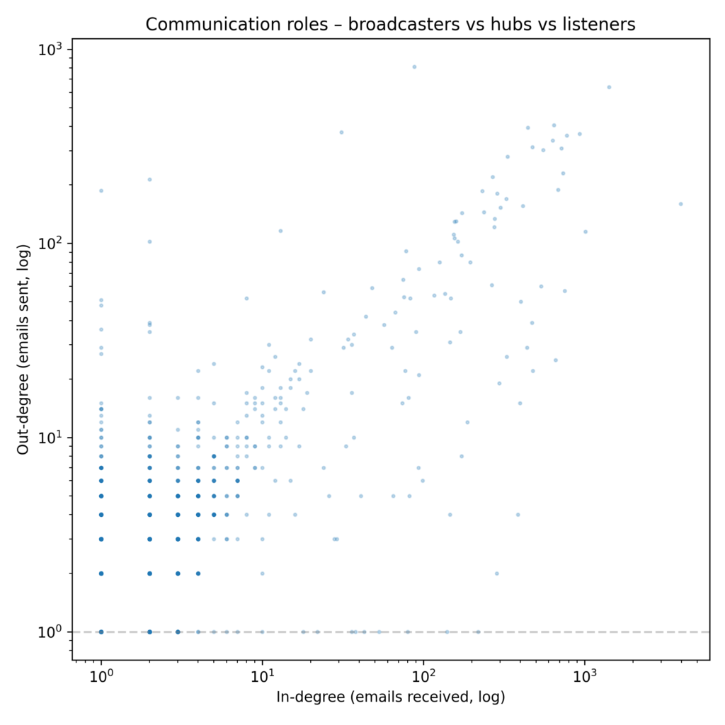
- In- vs. out-degree scatter plot (log–log).
This separates roles:- Nodes high on both axes act as brokers and cross-team connectors.
- High in-degree but low out-degree often signals escalation points or mailboxes where many issues land but few are initiated.
- High out-degree but low in-degree suggests broadcasters whose messages fan out but who receive relatively little direct traffic.
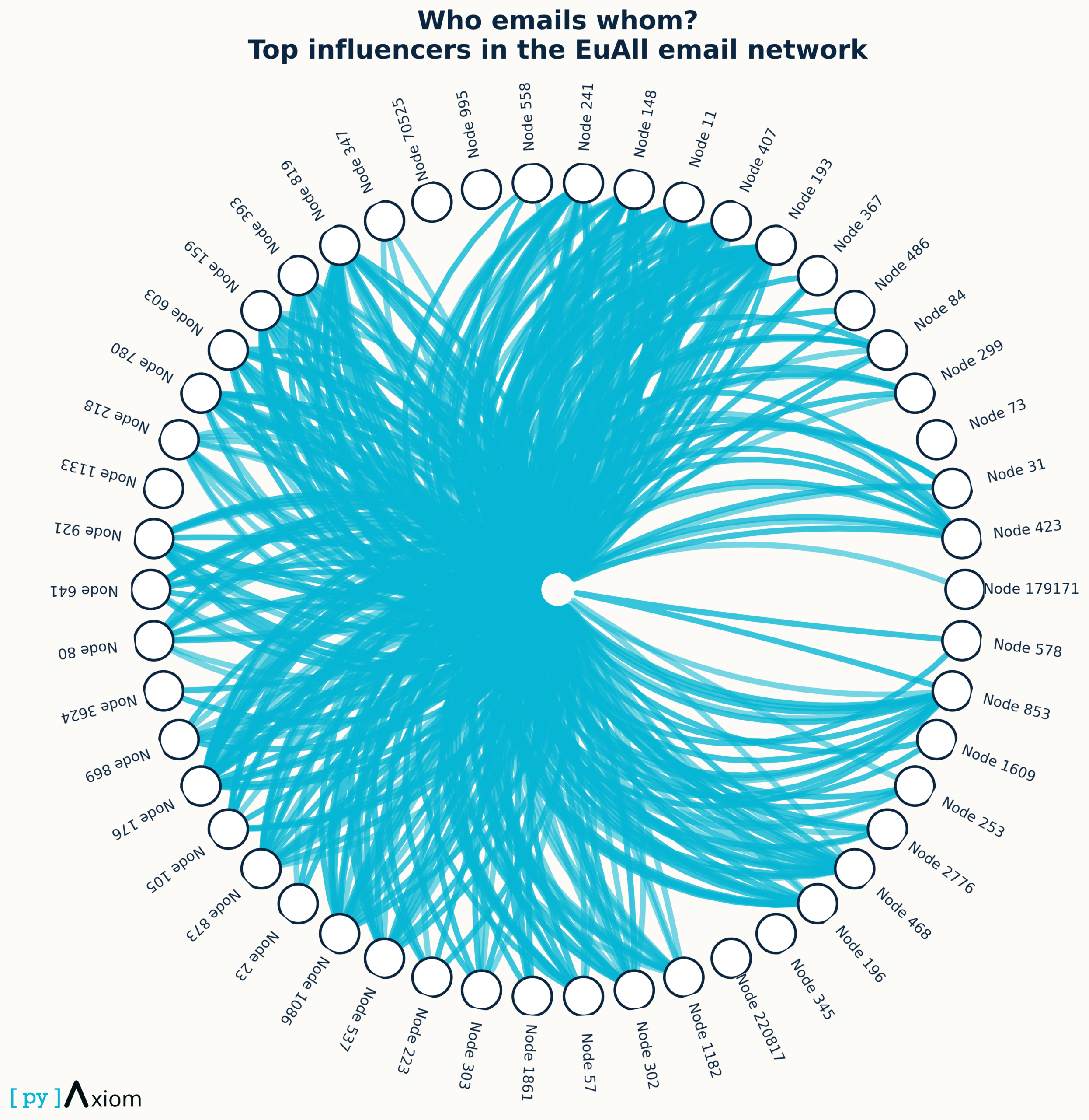
- Circular “chord-style” diagram for the top influencers.
We select the top 12 nodes by total degree and draw them on a circle. Directed links between them show who e-mails whom inside this elite core. Visually this mirrors a chord diagram: thick bundles of edges indicate strong mutual communication between key influencers; isolated spokes flag individuals who are highly connected to the wider organisation but less connected among themselves.
Together these views move from global structure to a focused lens on the informal leadership circle.
Results / Charts
Highly unequal communication load
- The degree distribution on a log–log scale is heavy-tailed; most mailboxes have 1–3 connections, while a few have several thousand.
- The Gini coefficient of total degree is about 0.70, indicating strong inequality..
- From the Lorenz curve:
- The top 0.1% of mailboxes (~265 nodes) account for ≈ 31% of all email interactions.
- The top 1% (~2,650 nodes) handle ≈ 55% of the traffic.
- The top 10% already concentrate ≈ 68% of communication.
- In other words, email traffic is heavily concentrated in a very small elite of mailboxes.
A large giant component with many small islands
- When we ignore direction, the network splits into 15,836 connected components.
- The largest component contains ≈ 225,000 nodes, roughly 85% of all mailboxes – this is the “core” corporate communication network.
- The remaining 15% are tiny clusters and isolates: detached teams, external contacts, or dormant addresses.
Influencer nodes and communication roles
This heatmap maps fraud share across the joint space of age group and monthly income band — one of the most revealing combinations in the dataset.
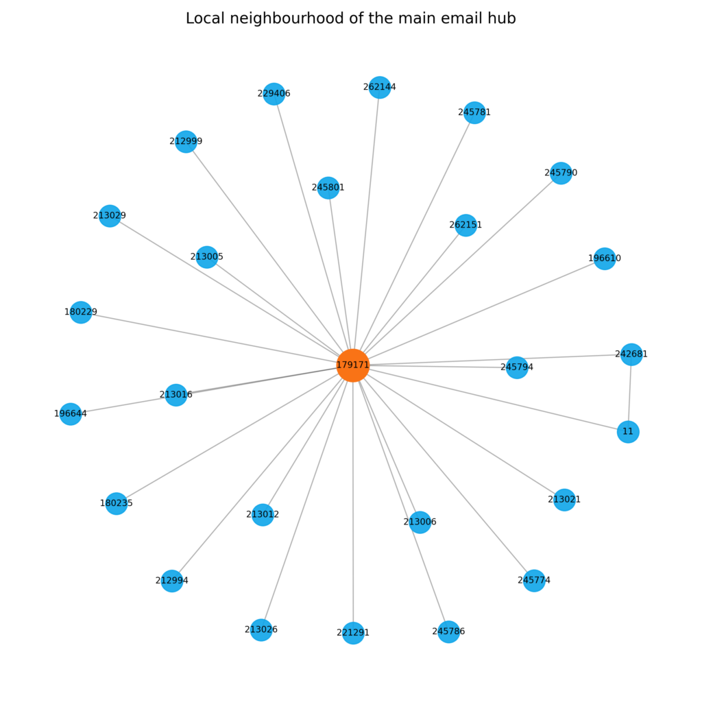
- The top-degree node (Node 179171) participates in 7,636 email relations:
- 7,631 as receiver, only 5 as sender.
- This is a textbook information sink: a central mailbox that many people write to, but that rarely initiates conversation (think of a shared support inbox or escalation mailbox).
- Other high-degree nodes show complementary patterns:
- Some have very high out-degree and modest in-degree, acting as broadcasters or announcement mailboxes.
- Others combine high in- and out-degree and sit in the upper-right quadrant of the role map – these are the true hubs that both collect and redistribute information.
- The ego-network around the main hub shows a star-like pattern: one central node connected to a tight ring of ~25 high-volume neighbours, with relatively fewer connections among those neighbours.
- This indicates a hub-and-spoke structure, where the central mailbox coordinates work across otherwise loosely connected groups.

Who emails whom?
- The chord-style figure focuses on the top 12 influencers by total degree.
- Each node occupies a slice of the circle; chords show direct email ties between them.
- Even among this elite, the subgraph is sparse: a few dense pairs exchange messages, while many connections run from or to the main hub.
- Visually, this makes clear that the core leadership or coordination layer is not a fully-connected clique but a set of specialised hubs with distinct roles.
Business Impact
Operational risk & continuity
- When 0.1–1% of mailboxes carry over half of all email traffic, the organisation is structurally dependent on a small group of individuals or shared inboxes.
- These addresses are single points of failure: illness, turnover, or access problems can disrupt large parts of the communication flow.
- Recommendation: treat high-degree mailboxes as critical infrastructure – set up backup owners, shared access, and clear escalation paths.
Process mapping through communication patterns
- The roles inferred from in- vs out-degree help map informal processes:
- High-in / low-out nodes → intake & escalation points (customer support, reporting mailboxes).
- High-out / low-in nodes → broadcast channels (internal newsletters, HR announcements).
- High-in / high-out nodes → coordinators / project managers.
- Even without knowing job titles, management gains a high-level picture of how work actually flows and whether this matches the formal org chart.
Targeted compliance and awareness programmes
- The same high-degree mailboxes are also where phishing, data-loss, and compliance breaches are most likely to have impact.
- Instead of a one-size-fits-all security programme, the network view allows:
- Prioritised training and monitoring for key influencers and hubs.
- Focused anomaly detection on these nodes (sudden spikes, unusual contacts, off-hours behaviour).
Change-management and communication planning
- For major strategic announcements or change programmes, the identified hubs are the natural amplifiers:
- they already have trust and visibility in the network,
- and their out-degree indicates real reach.
- Communication and HR teams can use the list of top hubs as a “network of champions” to involve early, brief more deeply, and equip with tailored materials.